Python Tutorial 1: Basic Operations and Plotting
This tutorial shows basic examples on how to load, handle, and plot the EM-DAT data using the pandas Python data analysis package and the matplotlib charting library.
Note: The Jupyter Notebook version of this tutorial is available on the EM-DAT Python Tutorials GitHub Repository.
Import Modules
Let us import the necessary modules and print their versions. For this tutorial, we used pandas v.2.1.1 and matplotlib v.3.8.3. If your package versions are different, you may have to adapt this tutorial by checking the corresponding package documentation.
import pandas as pd #data analysis package
import matplotlib as mpl
import matplotlib.pyplot as plt #plotting library
for i in [pd, mpl]:
    print(i.__name__, i.__version__)
pandas 2.1.1
matplotlib 3.8.3
Load EM-DAT
To load EM-DAT:
- Download the EM-DAT data at https://public.emdat.be/ (registration is required, see the EM-DAT Documentation page on Data Accessibility);
- Use the pd.read_excel method to load and parse the data into a
pd.DataFrameobject; - Check if the data has been successfully parsed with the
pd.DataFrame.infomethod.
Notes:
- You may need to install the
openpyxlpackage or another engine to make it possible to read the data. - Another option is to export the
.xlsxfile into a.csv, and use thepd.read_csvmethod; - If not in the same folder as the Python code, replace the filename with the relative path or the full path, e.g.,
E:/MyDATa/public_emdat_2024-01-08.xlsx
#!pip install openpyxl
df = pd.read_excel('public_emdat_2024-01-08.xlsx') # <-- modify file name or path
df.info()
<class 'pandas.core.frame.DataFrame'>
RangeIndex: 15560 entries, 0 to 15559
Data columns (total 46 columns):
 #   Column                                     Non-Null Count  Dtype
---  ------                                     --------------  -----
 0   DisNo.                                     15560 non-null  object
 1   Historic                                   15560 non-null  object
 2   Classification Key                         15560 non-null  object
 3   Disaster Group                             15560 non-null  object
 4   Disaster Subgroup                          15560 non-null  object
 5   Disaster Type                              15560 non-null  object
 6   Disaster Subtype                           15560 non-null  object
 7   External IDs                               2371 non-null   object
 8   Event Name                                 4904 non-null   object
 9   ISO                                        15560 non-null  object
 10  Country                                    15560 non-null  object
 11  Subregion                                  15560 non-null  object
 12  Region                                     15560 non-null  object
 13  Location                                   14932 non-null  object
 14  Origin                                     3864 non-null   object
 15  Associated Types                           3192 non-null   object
 16  OFDA Response                              15560 non-null  object
 17  Appeal                                     15560 non-null  object
 18  Declaration                                15560 non-null  object
 19  AID Contribution ('000 US$)                490 non-null    float64
 20  Magnitude                                  3356 non-null   float64
 21  Magnitude Scale                            9723 non-null   object
 22  Latitude                                   1809 non-null   float64
 23  Longitude                                  1809 non-null   float64
 24  River Basin                                1197 non-null   object
 25  Start Year                                 15560 non-null  int64
 26  Start Month                                15491 non-null  float64
 27  Start Day                                  14068 non-null  float64
 28  End Year                                   15560 non-null  int64
 29  End Month                                  15401 non-null  float64
 30  End Day                                    14132 non-null  float64
 31  Total Deaths                               12485 non-null  float64
 32  No. Injured                                5694 non-null   float64
 33  No. Affected                               7046 non-null   float64
 34  No. Homeless                               1312 non-null   float64
 35  Total Affected                             11508 non-null  float64
 36  Reconstruction Costs ('000 US$)            33 non-null     float64
 37  Reconstruction Costs, Adjusted ('000 US$)  29 non-null     float64
 38  Insured Damage ('000 US$)                  691 non-null    float64
 39  Insured Damage, Adjusted ('000 US$)        683 non-null    float64
 40  Total Damage ('000 US$)                    3070 non-null   float64
 41  Total Damage, Adjusted ('000 US$)          3020 non-null   float64
 42  CPI                                        15056 non-null  float64
 43  Admin Units                                8336 non-null   object
 44  Entry Date                                 15560 non-null  object
 45  Last Update                                15560 non-null  object
dtypes: float64(20), int64(2), object(24)
memory usage: 5.5+ MB
Example 1: Japan Earthquake Data
Filtering
Let us focus on the EM-DAT earthquakes in Japan from the years 2000 to 2003 and create a suitable filter utilizing the EM-DAT columns Disaster Type, ISO and Start Year.
For simplicity, let’s retain only the columns Start Year, Magnitude, and Total Deaths and display the first five entries using the pd.DataFrame.head method.
Note: For further details about the columns, we refer to the EM-DAT Documentation page EM-DAT Public Table.
eq_jpn = df[
    (df['Disaster Type'] == 'Earthquake') &
    (df['ISO'] == 'JPN') &
    (df['Start Year'] < 2024)
][['Start Year', 'Magnitude', 'Total Deaths', 'Total Affected']]
eq_jpn.head(5)
| Start Year | Magnitude | Total Deaths | Total Affected | |
|---|---|---|---|---|
| 392 | 2000 | 6.1 | 1.0 | 100.0 |
| 610 | 2000 | 6.7 | NaN | 7132.0 |
| 1013 | 2001 | 6.8 | 2.0 | 11261.0 |
| 2791 | 2003 | 7.0 | NaN | 2303.0 |
| 2884 | 2003 | 5.5 | NaN | 18191.0 |
Grouping
Let us group the data to calculate the number of earthquake events by year and plot the results.
- Use the
groupbymethod to group based on one or more columns in a DataFrame, e.g.,Start Year; - Use the
sizemethod as an aggregation method (orcount). - Plot the results using the
pd.DataFrame.plotmethod.
Note: The count method provides the total number of non-missing values, while size gives the total number of elements (including missing values). Since the field Start Year is always defined, both methods should return the same results.
eq_jpn.groupby(['Start Year']).size().plot(kind='bar', ylabel='Count')
<Axes: xlabel='Start Year', ylabel='Count'>
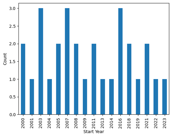
Output plot
Customize Chart
The pandas library relies on the matplotlib package to draw charts. To have more flexibility on the rendered chart, let us create the figure using the imported plt submodule.
# Group earthquake data by 'Start Year' and count occurrences
eq_cnt = eq_jpn.groupby(['Start Year']).size()

# Initialize plot with specified figure size
fig, ax = plt.subplots(figsize=(7, 2))

# Plot number of earthquakes per year
ax.bar(eq_cnt.index, eq_cnt)

# Set axis labels and title
ax.set_xlabel('Year')
ax.set_ylabel('N° of Earthquakes')
ax.set_yticks([0, 1, 2, 3])  # Define y-axis tick marks
ax.set_title('EM-DAT Earthquakes in Japan (2000-2023)')
Text(0.5, 1.0, 'EM-DAT Earthquake in Japan (2000-2023)')
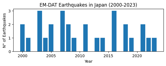
Output plot
Example 2: Comparing Regions
Let us compare earthquake death toll by continents. As before, we filter the original dataframe df according to our specific needs, including the Region column.
eq_all = df[
    (df['Disaster Type'] == 'Earthquake') &
    (df['Start Year'] < 2024)
][['Start Year', 'Magnitude', 'Region', 'Total Deaths', 'Total Affected']]
eq_all.head(5)
| Start Year | Magnitude | Region | Total Deaths | Total Affected | |
|---|---|---|---|---|---|
| 23 | 2000 | 4.3 | Asia | NaN | 1000.0 |
| 33 | 2000 | 5.9 | Asia | 7.0 | 1855007.0 |
| 36 | 2000 | 4.9 | Asia | 1.0 | 10302.0 |
| 41 | 2000 | 5.1 | Asia | NaN | 62030.0 |
| 50 | 2000 | 5.3 | Asia | 1.0 | 2015.0 |
In this case,
- Use the
groupbymethod to group based on theRegioncolumn; - Use the
summethod for theTotal Deathsfield as aggregation method; - Plot the results easilly using the
pd.DataFrame.plotmethod.
eq_sum = eq_all.groupby(['Region'])['Total Deaths'].sum()
eq_sum
Region
Africa        5863.0
Americas    229069.0
Asia        548766.0
Europe         783.0
Oceania        641.0
Name: Total Deaths, dtype: float64
Finally, let us make an horizontal bar chart of it using matplotlib. In particular,
- use the
ax.ticklabel_formatmethod to set the x axis label as scientific (in thousands of deaths); - use the
ax.invert_yaxisto display the regions in alphabetical order from top to bottom.
fig, ax = plt.subplots(figsize=(4,3))
ax.barh(eq_sum.index, eq_sum)
ax.set_xlabel('Total Earthquake Deaths')
ax.ticklabel_format(style='sci',scilimits=(3,3),axis='x')
ax.invert_yaxis()
ax.set_title('EM-DAT Earthquake Deaths by Regions')
Text(0.5, 1.0, 'EM-DAT Earthquake Deaths by Regions')
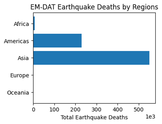
Output plot
Example 3: Multiple Grouping
At last, let us report the earthquake time series by continents. To avoid the creation of a ['Region', 'Start Year'] multiindex for future processing, we set the argument as_index to False. As such, Region and Start Year remain columns.
eq_reg_ts = eq_all.groupby(
    ['Region', 'Start Year'], as_index=False
)['Total Deaths'].sum()
eq_reg_ts
| Region | Start Year | Total Deaths | |
|---|---|---|---|
| 0 | Africa | 2000 | 1.0 |
| 1 | Africa | 2001 | 0.0 |
| 2 | Africa | 2002 | 47.0 |
| 3 | Africa | 2003 | 2275.0 |
| 4 | Africa | 2004 | 943.0 |
| ... | ... | ... | ... |
| 92 | Oceania | 2016 | 2.0 |
| 93 | Oceania | 2018 | 181.0 |
| 94 | Oceania | 2019 | 0.0 |
| 95 | Oceania | 2022 | 7.0 |
| 96 | Oceania | 2023 | 8.0 |
97 rows × 3 columns
Next, we apply the pivot method to restructure the table in a way it could be plot easilly.
eq_pivot_ts = eq_reg_ts.pivot(
    index='Start Year', columns='Region', values='Total Deaths'
)
eq_pivot_ts.head()
| Region | Africa | Americas | Asia | Europe | Oceania |
|---|---|---|---|---|---|
| Start Year | |||||
| 2000 | 1.0 | 9.0 | 205.0 | 0.0 | 2.0 |
| 2001 | 0.0 | 1317.0 | 20031.0 | 0.0 | 0.0 |
| 2002 | 47.0 | 0.0 | 1554.0 | 33.0 | 5.0 |
| 2003 | 2275.0 | 38.0 | 27301.0 | 3.0 | NaN |
| 2004 | 943.0 | 10.0 | 226336.0 | 1.0 | NaN |
ax = eq_pivot_ts.plot(kind='bar', width=1, figsize=(6,3))
ax.set_ylabel('Total Deaths')
ax.set_title('EM-DAT Earthquake Deaths by Regions')
Text(0.5, 1.0, 'EM-DAT Earthquake Deaths by Regions')
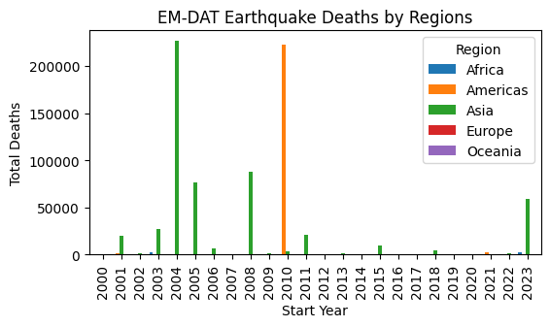
Output plot
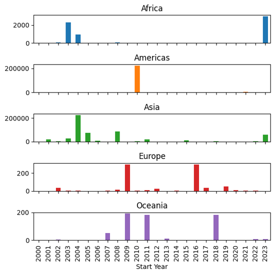
In order to be able to visualize the data in more details, let us make a subplot instead by setting the subplot argument to True within the plot method.
ax = eq_pivot_ts.plot(kind='bar', subplots=True, legend=False, figsize=(6,6))
plt.tight_layout() # <-- adjust plot layout
Output plot
We have just covered the most common manipulations applied to a pandas DataFrame containing the EM-DAT data. To delve further into your analyses, we encourage you to continue your learning of pandas and matplotlib with the many resources available online, starting with the official documentation.
If you are interested in learning the basics of making maps based on EM-DAT data, you can also follow the second EM-DAT Python Tutorial.